With the extreme popularity social media is getting especially Facebook, it's considered a big loss not to have a Facebook page for your store, business, company, or whatever type of organization it is.
While a Facebook page is important!
The most important part of the page is the cover photo which represents the personality of your page and business, and needs to be taken care of with an attractive design, grabbing the curiosity of the visitor to dig more and engage with your page and have more interest.
This helps to promote your organization allowing your clients and followers to share and invite their friends to your page.
If you are having trouble with the Facebook cover photo and the correct size, here you will find the correct cover photo size and the solution to make it fit well without any cropping out on the Desktop display or Mobile / Smartphone display.
We would like to advise that the cover size that Facebook is mentioning on its support pages is actually not the practical solution.
We will mention here what Facebook itself has said and also the solution we recommend. Which works perfectly.
You can also check here for facebook profile picture size in 2020.
1. What is Facebook cover photo size!
Facebook is known to be changing the theme and styles of its website now and then however, if you are looking for the Facebook cover photo size, here is the answer from the Facebook website help section itself:
- On Computers: Displays at 820 pixels wide by 312 pixels tall on your Page.
- On Smartphones: 640 pixels wide by 360 pixels tall.
Though, we recommend other dimensions for the best results in the next paragraph.
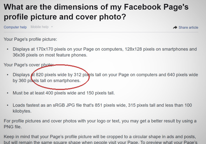
As it appears you can tell the dimensions here are different as computer screens are wider while smartphones are not that wide when the cover photo is previewed. Facebook itself will crop the photo to fit on smartphones display from the uploaded version of your cover photo.
2. The recommended Facebook cover photo size
The size Facebook is providing for the cover photo size is not the best if your cover design has text or parts of the design on the edges
It would be better if you consider centering the design parts of the cover and any text, being away from the right and left edges will avoid your design text to be cropped out when Facebook makes the other version of your cover for mobile.
However in order not to lose parts of your cover photo design
We recommend you use:
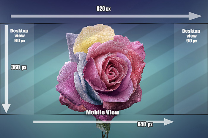
The dimensions 820 pixels by 360 pixels or 1640 pixels by 720 pixels.
which has the same ration but with higher quality output. This should fit well for Desktop & Mobile at the same time while you should still keep any text and main cover design centered in the middle.
As in the Facebook cover photo below, it was sized as we recommend and you shall include the text and main design in the middle, leaving the 90 pixels on the right and the left as an extended background space.
3. Why would you need to know the Facebook cover photo size!
If you are not a professional graphic designer or at least familiar with cropping and basic Photoshop tricks, you may face a hard time making a cover photo for Facebook, parts of your photo may get cropped out.
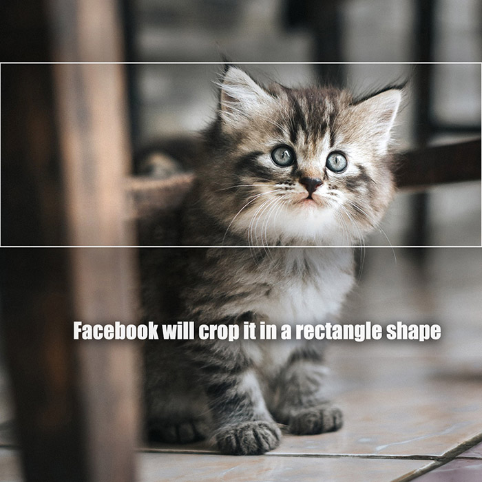
This happens mostly when your photo is more of a square in shape, while the Facebook cover photo is more of a rectangle shape.
An example here is more of a square-shaped photo when trying to upload it as a Facebook cover photo. it will show the Highlighted part as shown in the sample below as the only part which will be used, while the rest of the photo will be cropped out.
4. Need someone to do it for you!?
A simple solution is outsourcing a photo editing service to fix / re-design and crop your Facebook cover photo, Here at Photorelive we are a professional photo retouching company that can edit the cover photo for you the way you want.
We will do it professionally and make sure that it fits with your Facebook page.
You can contact us for any further information, or create an account and order immediately, you will get your photo finished in 24 hours.
5. Tips for a better Facebook cover photo
A. High quality version:
You should save your photo in a high-quality version without compressing the size, as Facebook already will compress your photo to save space on their servers even though you already did, which will not look appealing if compressed twice.
B. Your Facebook cover photo should be artistic: unique and creative.
This is one of the main things which will grab the eyes of your clients and any other visitor, your cover photo is the first thing that a visitor looks at which should grab the attention for a better engagement experience.
C. What is your page about:
Your cover photo should show clearly what is that page or business about clearly with an example of something that you sell or information about your page.
You may also include a small text of how long your business has been running or the number of your clients and buyers which is appealing to the new visitors and expected clients.
D. Your latest offer on top:
One of the smart ideas is to put an offer in your Facebook cover photo to grab the attention fast, which is much better than if your offer was just in a normal post.
The offer including a discount or a price in the cover photo is easier to reach, for people visiting for the first time and audience to get to reach your latest and most important deals.
The $ sign always attracts the eyes ..
E. Upcoming events announcement:
You have an event that you need to advertise for, a cover photo is the best place to make that announcement loud and bring people to read more about it, while in the text part of the cover photo post can be for a deeper explanation which usually motivates the visitors to interact more with your page.
F. Contact information:
Address on the map, phone no, including your store or company's contact information is a good idea for your clients to reach you faster and know your location on the map, you can also include your email address.
These information has its place on your Facebook page already, but including them again in your cover photo is a better experience for your audience and expected buyers, especially including the hotline number with a little big font, which is almost a call to action driving sales.
G. Photos of the winning client:
This is one of the good ideas for a Facebook cover photo in case if your company/business made a competition and there was a winner, it would be better to put the picture of the winning client into the cover photo holding the prize.
which is somehow a big teaser to other clients motivating them to get into the competition the next time it gets done, additionally it gives credibility and shows the honesty of your brand with true proofs.
6. Things to avoid in your cover photo
A. A crowded picture:
Using a cover photo that is full of text, pictures and designs where there is no space for the background. the cover photo must be simple and to the point showing the personality of your page/business with your main announcement or offer to gain engagements and interaction with your Facebook page.
B. Facebook wrong sized cover photo:
Using the wrong size will cost part of your design in the cover photo to be cropped out when uploading the photo to Facebook, in case if the design or text on the picture is on the sides/edges of the picture.
In addition to the size we recommended to use above, we still recommend to center any text and the main design and leaving the left and right side with the solid or extended background.
C. Low quality cover photo:
This should represent your brand and its culture, of course you wouldn't want to risk it with a low-quality material of a cover photo. Always save the picture with the highest quality.
D. A cover photo without a description:
In case of publishing an offer or a discount in your cover photo, a description would better be included in the post of the cover photo for a better explanation and call to action link probably or else a lot of new visitors may just lose hope fast and vanish away.
Your offers must be in steps taking the client / expected client a step by step to the targeted point.
7. Inspirations for Facebook cover photos:
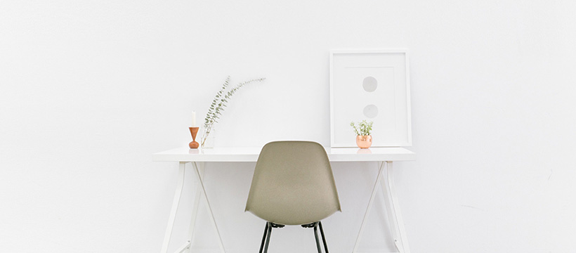
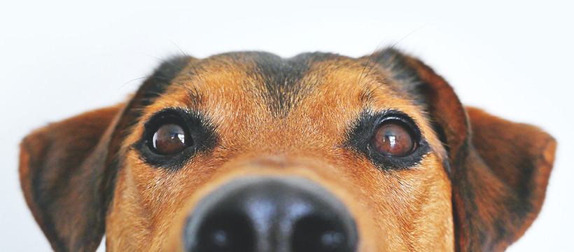
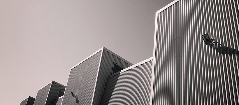
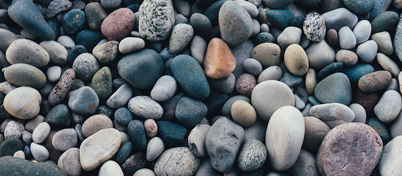
Below are samples of cropped Facebook cover photos that you can have the inspiration from.
You can also download and use them for your Facebook page, and add any text you want on.










Conclusion:
The first impression is the key to a good start, and your Facebook page starts with the cover photo, picking the correct colors which match with your brand colors and the logo can help to please the eyes of a new visitor and a proof for professionality and credibility.
While sizing the Facebook cover photo matters as it's considered the first good step to avoid and cuts in your design, considering the sizes are important even before you start designing it either on Photoshop or any other software.
The last thing to mention here is the emotional side of the cover photo which plays a great part making the cover photo a unique piece of art, that can be done through nice and good quotes that you can find on the internet which are many, goes along with the colors, the message, the personality you are showing and the visual side.
All that together can in a well-made harmony can play a good part in the first step of a successful Facebook page and business.
