Did you know? when you look at a product photo, your brain takes just 13 milliseconds to process the image and make a judgement. that's faster than the blink of an eye! in this ever-competitive world of e-commerce, your product photos need to be as eye-catching and visually pleasing as
Possible to leave a lasting impression on potential customers. in this blog post, we will discuss how to use colors and symmetry to highlight your brand and product quality, creating a sense of luxury and sophistication.
Enhancing brand identity and quality with colors and symmetry
Color is one of the most powerful tools in a photographer's toolbox. by choosing the right colors, you can communicate your brand's identity, evoke emotions, and create a sense of balance and harmony in your product photos.
Here are some tips on how to use colors and symmetry to enhance your brand and product quality:
1. Choose a color scheme that reflects your brand's personality. consider your brand's values, target audience, and competitors before making a decision. a well-chosen color scheme can strengthen your brand identity and make your products stand out from the competition.
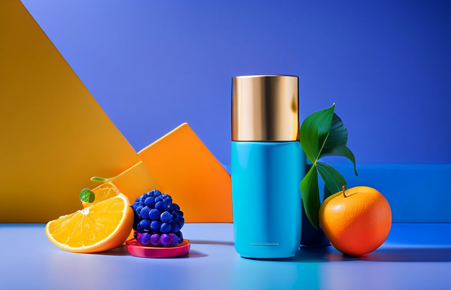
2. Use complementary colors for harmony. complementary colors are those that are opposite each other on the color wheel (e.g., red and green, blue and orange). using complementary colors can create a visually appealing balance, making your product photos more pleasing to the eye.
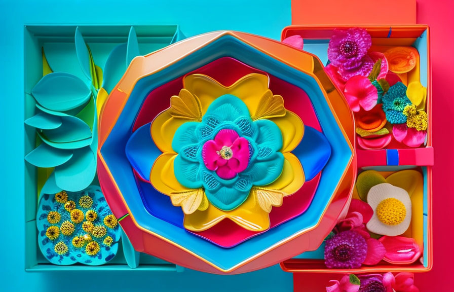
3. Incorporate symmetry to create a sense of order and stability. by arranging your products symmetrically, you can convey an impression of quality and reliability. symmetrical compositions can also make your photos look more professional and polished.
Creating a sense of luxury and sophistication with colors and symmetry
A luxurious and sophisticated product photo can entice customers to explore your products further and make a purchase. here are some ways to achieve this look using colors and symmetry:
1. Use a limited color palette. luxury brands often use a small number of colors in their product photos, creating a sense of exclusivity and sophistication. limiting your color palette can also help to create a more cohesive and harmonious look.
2. Incorporate metallic colors. gold, silver, and other metallic colors can add a touch of opulence to your product photos. use them sparingly to accentuate key features or to create a sense of depth and dimension.
3. Use color to create contrast and depth. by using contrasting colors or different shades of the same color, you can create a sense of depth and dimension in your product photos. this can help to draw the viewer's eye to the most important parts of your image.
4. Experiment with lighting. the right lighting can add a sense of drama and sophistication to your product photos. consider using soft, diffused light to create a luxurious atmosphere, or try backlighting to accentuate the colors and textures of your products.
5. Combine symmetry and asymmetry for visual interest. while symmetry can create a sense of order and stability, incorporating some asymmetrical elements can add a touch of intrigue and visual interest. experiment with different arrangements and compositions to find the perfect balance.
A fun fact: the psychology of color
Did you know that different colors can evoke different emotions and associations in the human mind? for example, red is often associated with passion and excitement, while blue can evoke feelings of calmness and trust. by understanding the psychology of color, you can choose colors that will resonate with your
Target audience and convey the desired message about your brand and products.
A little-known fact: the golden ratio
The golden ratio, also known as the divine proportion, is a mathematical ratio that appears frequently in nature, art, and architecture. this ratio, approximately 1.618:1, is believed to be aesthetically pleasing and can be found in the proportions of many famous works of art, such as the parthenon and the
Great pyramid of giza. by incorporating the golden ratio into your product photos, you can create compositions that are visually appealing and harmonious.
Conclusion
The power of colors and symmetry in product photography should not be underestimated. by using these elements strategically, you can create visually compelling images that highlight your brand's identity and the quality of your products, while also evoking a sense of luxury and sophistication.
With careful consideration of color schemes, lighting, and composition, your product photos can leave a lasting impression on potential customers and help your brand stand out in the competitive world of e-commerce.