
In this digital age, photography has become more accessible than ever. as a result, the ability to manipulate and enhance images has become an essential skill for photographers and creative professionals. one of the most critical aspects of image editing is color management, which helps to achieve the desired look
And feel in your photos. in this blog post, we will discuss various techniques for Photo color correction and Color grading photography, focusing on how to adjust the colors and tones for different purposes.
The importance of color in photography
Color plays a crucial role in the overall impact of a photograph. it can evoke a mood, create a sense of depth, and even convey a narrative. by mastering the art of Color grading photos, you can transform ordinary snapshots into stunning works of art.
The difference between color correction and color grading
Before diving into the techniques, it is vital to understand the difference between Image color correction and Color grading.
1. Image color correction: this process involves adjusting the colors in a photo to make them more accurate, natural, and balanced. it typically involves fixing issues like color casts, incorrect white balance, and overexposed or underexposed areas. 2.
Color grading: this is a creative process in which you deliberately manipulate the colors and tones of an image to achieve a specific look or style. this can include altering colors to create a specific mood, emphasizing certain elements, or simply making your photos more visually appealing.
Now that we understand the difference, let's explore how to adjust the colors and tones of your photos for different purposes.
Adjusting colors and tones for various purposes
1. photo color correction for realism
When your goal is to create a realistic and accurate representation of a scene, Photo color correction is essential. here are some steps to follow for achieving accurate colors in your photos:
1. Fix white balance: set the correct white balance by adjusting the temperature and tint sliders in your editing software. this will remove any color cast and ensure that the whites in your image appear truly white.
2. Adjust exposure: to avoid overexposed or underexposed areas, use the exposure slider to correct the overall brightness of your image. you can also use the highlights and shadows sliders to recover lost details and create a more balanced exposure.
3. Tweak saturation and vibrance: saturation and vibrance adjustments can help you control the overall color intensity in your photo. use these sliders carefully to avoid oversaturation, which can make your image look unnatural.
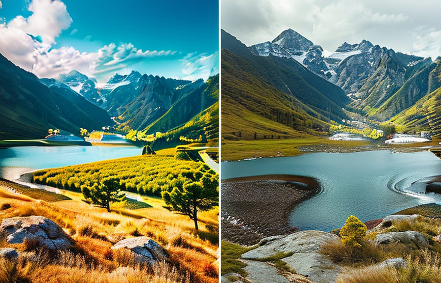
2. color grading photos for mood and atmosphere
Color grading photography allows you to create a specific mood or atmosphere in your photos. here are some tips on how to use color grading to enhance the emotional impact of your images:
1. Choose a color palette: decide on a color scheme that complements the subject matter and the desired mood. for example, warm colors like orange and yellow can create a cozy, inviting atmosphere, while cool colors like blue and green can evoke a sense of calm and tranquility. 2.
Manipulate the tone curve: the tone curve is a powerful tool for adjusting the overall contrast and tonality of your image. by creating an s-shaped curve, you can add contrast and make your image pop.
Conversely, a flat curve can create a softer, more dreamy look.
3. Use selective color adjustments: by targeting specific color channels, you can emphasize or de-emphasize certain colors in your image. this can help you create a harmonious color palette and draw attention to specific elements within the frame.
3. color correcting for print and screen
When preparing your photos for print or display on a screen, Image color correction is crucial for ensuring accurate and consistent colors. here are some keep in mind:
1. Calibrate your monitor: regularly calibrating your monitor ensures that the colors you see on your screen accurately represent the colors in your image files.
2. Use color profiles: make sure you are using the appropriate color profile for your intended output, such as srgb for web use Or adobe rgb for print. this ensures that your colors are accurately reproduced across different devices and media.
3. Soft proofing: before printing your photos, use the soft proofing feature in your editing software to simulate how your image will appear on your chosen paper or display.
This allows you to make any necessary adjustments to ensure accurate colors and tones.
Conclusion
Mastering the art of Color grading photos and Photo color correction can take your photography to new heights. by understanding the differences between these two processes and learning how to adjust the colors and tones of your images for different purposes, you can create stunning and impactful photographs
That stand out from the crowd. so, don't be afraid to experiment and explore the limitless possibilities of color in your photography.